10 Tips to Perfect Brochure Design
Designing a brochure is probably one of the more rewarding projects in the field of graphic design. There is nothing more satisfying than creating something you can hold, touch, and read. In addition, design is more than just a layout, it includes texture and feel that digital projects such as website design cannot convey.
1. Understand the printing specifications. Our advice is to set the specifications of the brochure belonging to this project at the very beginning. You should know what you need and what you will create at the very beginning.
2. Carefully consider the needs of the user. The form and distribution of the brochure design should reflect the wishes of the audience. Even the design that looks like a traditional paper brochure can be digitally converted with the interactive features of the PDF format.
3. Use high-quality elements. You can't use low-quality elements when producing prints. Low-resolution photos or illustrations can easily affect and destroy the overall vision. So, everything you use needs to be high-quality and high-definition to ensure that your brochure design looks great. Including pictures, illustrations, icons, logos, fonts, and a clear color palette.
4. Use textures. There are many physical features you can include in a printed brochure design. These elements help increase the perceived value of the information because it is highly visually appealing to the reader.
5. Don’t forget the call to action. One of the most common elements in printed publications is the call to action. What is the purpose of the brochure? What should the user do after seeing or reading it? You need to make the purpose of the action clear to them. Whether it’s going to a certain place to attend an event or calling a phone number, identify what the user should do and encourage that behavior throughout the design process.
6. Consider the display path. Where will the user see or pick up your brochure? Create a graphic design that will still work in that environment. One of the most common problems with brochure design is forgetting that most brochure designs need to be applicable to multiple display paths.
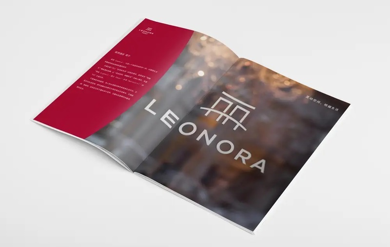
7. Stick to a visual theme. Go with white or a highly visual color? Go with a single design or prepare multiple versions? Find a theme for the brochure design you are preparing and stick to it. This is important whether you are thinking about the design from page to page, such as the cover and the inside pages should follow the same theme, or you can plan to create multiple versions of a similar brochure.