How to ensure readability in cosmetics brochure design?
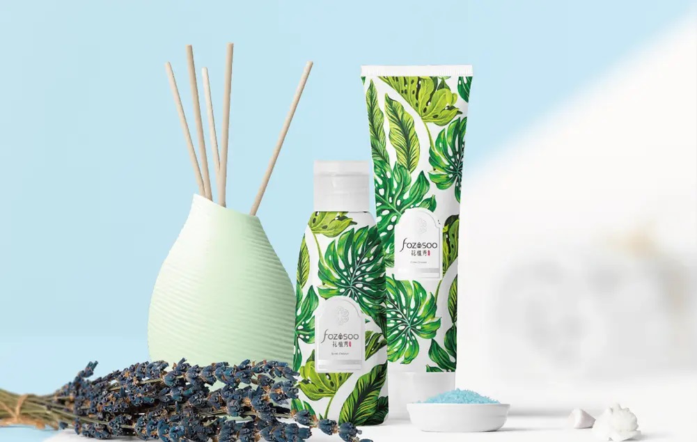
Cosmetics brochure design pays attention to a sense of integrity. From the brochure's size, text art, changes in catalogs and layouts, from the arrangement of pictures to the setting of colors, from the selection of materials to the quality of printing technology, all need to be considered and planned as a whole, and then all design elements should be reasonably mobilized to organically integrate them to serve the company's connotation.
Cosmetics brochure design must first be readable. At the same time, changes in text will also bring different feelings. Different fonts will give people different positioning. Graphics are a kind of visual symbol that uses images and colors to intuitively spread information. Cosmetics brochure design can have a striking effect and a reading effect.
Cosmetics brochure design can create an atmosphere, directly attract people's attention and emotional response, and can also more deeply reveal the personality characteristics of the theme and image, strengthen the perception, leave a deep impression on people, and give people a beautiful enjoyment while conveying information.
Ultimately, a good cosmetics brochure design needs to consider much more than that. It should also be based on the characteristics of its products. The color matching should pay attention to the selection and use of colors. The way of words should be coordinated with the graphics. The cosmetics brochure design should give people a refreshing feeling.
For most cosmetics brochure designs, they will do this, because only in this way can they guarantee to design a very good trademark for their customers at one time. When designing a trademark, it is necessary to consider the integration of various logos, which should include the main logo information, and also add some simple patterns, and choose the right colors. These are all specific design contents.


