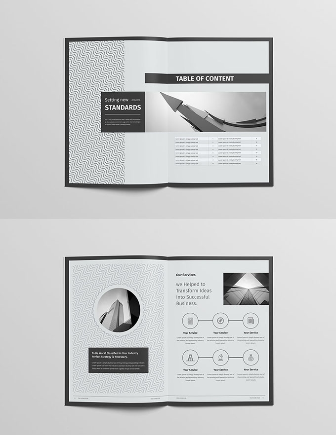
Picture album layout--text layout skills
Text wrapping is important. In album layout documents, how to provide readers with a more visually pleasing experience mainly depends on the following design techniques:
Under normal circumstances, the album layout document will be divided into theme, subtitle, theme decoration English, author (depending on the situation), and main text paragraphs. To make readers feel comfortable, there are usually several common features: first, the theme is prominent, the visual center is stable, there are no more things to catch the eye, and the theme is unique. Second, the text is distributed reasonably, one line is a line, a paragraph is a paragraph, and lines and paragraphs are inseparable.
How to make the theme stand out has been mentioned in the previous articles. Here I will reiterate it again. There are several ways to make the theme stand out. Among them, the commonly used ones are to increase the font size and boldness, and to increase the text size to cover the entire screen. The font size should be the largest, and it should be much larger than the second largest font size, so as to create a distance. Remember not to be stingy, and make the first largest font size and the second largest font size not much different. This will only make the theme very blurry. and chaos. There are also colors that are accentuated or brightened. The heavier the color, the more prominent the words will appear, such as black, dark blue, dark red and other dark colors. It's also the same that the darkest colors have to be distinguished from the lighter colors, and the gap needs to be widened. The combination of the above two methods can make the theme very prominent.
When the theme of the album layout is highlighted, the subtitle is involved. The subtitle is often the second largest font size I mentioned above. They usually play a role in enriching the theme. They not only make the theme look not monotonous, but also At the same time, it cannot take away from the theme. So their font size is several notches smaller than the theme, and the colors are much weaker. This organic combination of themes can highlight the visual center and determine the uniqueness of the theme. Then there is the way the text is arranged, which depends on character size, paragraph width and line spacing.
Generally, the character size of the main text is around size 8, so that the text of the main text will not be too obtrusive. The width of a paragraph is more likely to cause problems if you don't pay attention to it. Generally, when a line of text is too long, it will be difficult for people to change the line and look at another line to find the text that follows the next line. Therefore, you should pay attention to the lines of paragraphs when composing albums. Don't be too wide or too long. In the most basic common sense, the character spacing should be smaller than the line spacing, and the line spacing should be smaller than the paragraph spacing. Only in this way can a line of words, a paragraph of words, etc. be clearly distinguished. Sometimes you can see some designers making it seem like they can be read horizontally or vertically. As for what exactly it is, it confuses readers and even makes a joke.


